Google introduced the “mobile-friendly update” on April 21, 2015, with the goal of improving the position of mobile-friendly pages in mobile search results. In order to make the web more mobile-friendly one year later, in 2016, Google declared it will be enhancing the mobile-friendly ranking signal.
There was no benefit for mobile-friendly websites when a user searched on a desktop as Google’s mobile-friendly upgrade was solely intended to affect mobile search results.
Although the phrase “mobile-friendly website” is frequently used nowadays, do you actually understand what it means? Why is it important? the e-mail address you provided will not be published. What specifically makes it better, then? Let’s discuss what constitutes a mobile-friendly site and why it’s crucial.
It’s no secret that people use their smartphones and tablets increasingly frequently, and they anticipate that websites will be responsive to these devices as well. Because of this, having a mobile-friendly website is crucial. Without having to download or install anything, consumers can view your website from anywhere. Better user experience, higher conversion rates, and higher brand visibility are the main advantages.
Some of the best mobile ecommerce sites are Amazon, Flipkart, Myntra, Zomato, and other similar sites.
Even if your website is responsive, you still need to make sure the layout works well on small screens. With a responsive design, your whole website can be seen on smaller screens.
The main focus of your mobile site should be your landing page, while the desktop version should show extra information like special offers and other important details. If someone clicks on your social media post and goes to your site, a mobile-friendly site will let them get to your content right away.
-
It’s easy to get to
Imagine that a customer wants to buy something from your online store and goes to your website on his phone. The page doesn’t open right, so he has to use a desktop or laptop to open it. He is leaving your site. This is a problem that many people have when they shop online.
Modern web design techniques make it easier to use a mobile ecommerce site than one that doesn’t use them. You no longer have to worry about problems with loading, slow websites, or popups when you’re browsing. If you’re on a phone or tablet, all you have to do is open the URL that your phone or tablet browser gives you, tap the link, and you’re free to surf.
-
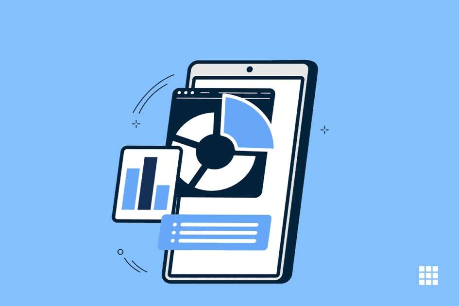
Better optimization for search engines (SEO)
SEO is one of the best reasons to make a website that works well on mobile devices. Search engine optimization, or SEO, is the process of making websites work well with search engines. Because these algorithms change often, it’s hard to know where a page will rank in search results.
A website that works well on mobile devices is more likely to rank higher and show up at the top of Google and other search engine results. Mobile users tend to type keywords instead of clicking on links, so a site that is easy to use on mobile devices can bring in more traffic and sales. Since mobile searches are already very important, having a website that works well on mobile devices makes it more likely that your business will show up in relevant searches.
-
Better User Experience
When you go to a mobile website, the experience is clean and easy to use. No extra stuff, just the content you want, so no ads or pop-ups you don’t want. A design that works well on mobile devices makes users more interested and happy.
Users won’t have to look around for the right button or menu item; they can just tap or swipe their way around it. People can also share information and talk to each other on social networks more easily when the mobile experience works well.
The mobile versions of websites are much easier to use than the desktop versions. People often use their phones to look for goods or services online. When they find the product or service they want, they want to be able to buy it without leaving the mobile screen. Having a mobile version makes it easy for them to switch between devices without losing their place on the website.
-
Increased the number of sales
Getting visitors to buy is one of the hardest things for anyone who sells online. Most of the time, mobile sites do much better than regular sites. People don’t spend as much time on mobile websites, which means they are more likely to buy something.
Also, people who use smartphones are much more likely to buy things than those who use laptops or desktops. A well-made mobile site will lead to more sales.
-
Easy to get around
More and more people are using mobile websites. As was said above, more than half of all traffic to the web now comes from mobile devices. If your website is easy to use on a phone, you can take advantage of this trend.
When most people go on the internet, their first thought is, “I need to get off my computer!” If they spend more time on their phone than on their laptop or desktop, they will lose business. When someone visits your site on their phone, they want it to be easy to get around.
Having a website that looks good on mobile screens and is easy to use and works well will help you reach more customers.
-
More repeat business
A mobile site decreases the number of people who leave the site quickly and makes people stay longer. People who use their phones to visit your e-commerce site stay longer and are much more likely to come back. This means that even after they buy something, they might come back again and again.
This gives you a chance to get to know your customers and keep them coming back. If your customers can shop from wherever is most convenient for them, they will be happier and more likely to stick with you.
Conclusion
Here is hoping that you have understood the article. In case you have any doubts, please share them with us in the comments section below.


Write A Comment