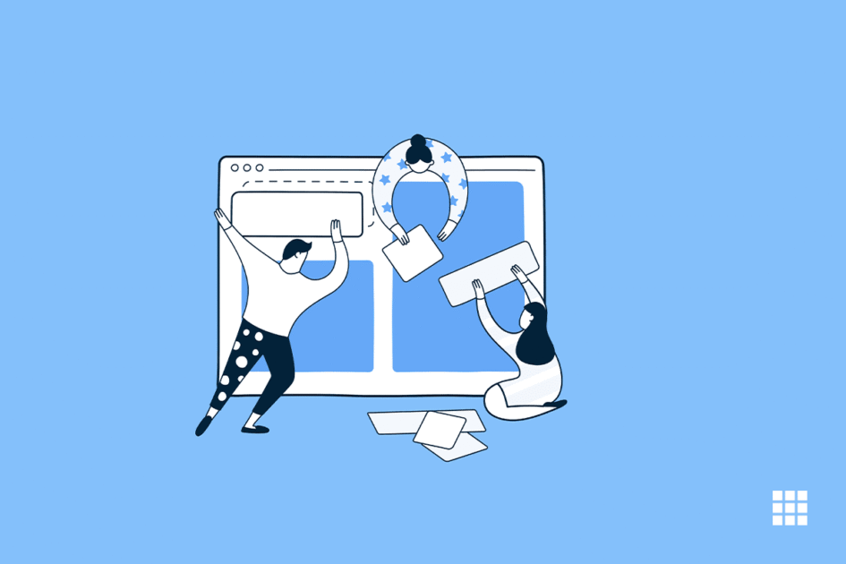
When making or changing a website, it’s easy to get caught up in how it looks. Is that the right shade of blue? Should the logo go on the right or the left side of the screen? What if we put a big animated GIF in the middle of the page?
But in a world where there are more than 1.8 billion websites, you need to make sure that yours is more than just a pretty face. It should be made for usability, which is how easy it is to use your website, and user experience (UX), which is how fun it is to use your website.
Now, it would take years to learn everything there is to know about these fields. But to give you a place to start, we’ve put together a list of the most important rules and best practises that you can use for your next website redesign or launch. Then, we’ll talk about 7 things your site needs to have if you want to use these suggestions. Let’s dive in.
-
Ease of use
Even though the way your website looks is important, most people don’t come to your site to judge how cool it looks. They want to finish a task or find a certain piece of information. So, design elements that aren’t needed and don’t do anything will only make it harder for visitors to do what they want to do.
From a user experience and usability point of view, simplicity is your best friend. If you have everything you need on a page, it’s hard to make it too simple. You can use this idea in a number of different ways, including:
Colors: In general, don’t use too many. The Handbook of Computer-Human Interaction says that your design should use no more than five (plus or minus two) different colours.
Typefaces: The typefaces you choose should be easy to read. They shouldn’t be too artsy, and if they have any script fonts at all, they should be used sparingly. Again, keep the text colour simple and make sure it stands out from the background colour. People often say to use no more than three different fonts in no more than three different sizes.
Graphics: Only use graphics if they help a user finish a task or do a certain function. Don’t just add graphics for the sake of it.
-
Visual Hierarchy
Visual hierarchy and simplicity are linked. It involves organising a website so visitors see the most important parts first. UX and usability optimisation is about getting people to perform what you want in a natural and pleasant way. You can call attention to certain parts of your site by moving, changing colours, or resizing.
Let’s consider the music brand Spotify, where it is giving out a premium pass of three months for free. And say the primary heading “Get 3 months of Premium for free”. Then this headline will be at the top of the visual hierarchy and highlighted in bold because it is the biggest and at the top of the page. It emphasises their goal. The “Get 3 Months Free” CTA follows. This CTA or the menu above lets users take action.
-
Navigability
To help users navigate your site, plan its navigation. Your site visitors shouldn’t have to worry about what to do next. The route from point A to point B should be simple. How to better site navigation:
- Make main navigation simple (and near the top of your page).
- Add footer navigation links.
- Breadcrumbs on every page (save the home page) help visitors remember how they got there.
- For keyword searches, place a search bar near the top of your site.
- Limit page navigation. Again, simplify!
- Link your page’s text and indicate its destination.
Don’t bury users. Make a pyramid-shaped wireframe map of your site’s pages. Each page that links to your homepage should be on the following layer. Most maps should be three levels deep.
Another tip: Stick with your site’s top navigation after you’ve chosen it. Your navigation should be named and located the same on every page.
This leads well into our fourth following point.
-
Consistency
Your site should appear and feel the same and have consistent navigation. Consistency in backdrops, colour schemes, typefaces, and writing tone improves usability and user experience (UX). Every page shouldn’t appear the same. Instead, develop layouts for multiple page types (e.g., landing pages, informational pages, etc.). Use these layouts consistently to help visitors understand what they’ll discover on a page.
Let us take the example of Airbnb. Airbnb’s “Help” pages follow a standard layout. Imagine if each “Help” page had a different layout for visitors. Many would shrug. Another tip: Stick with your site’s top navigation after you’ve chosen it. Your navigation should be named and located the same on every page.
-
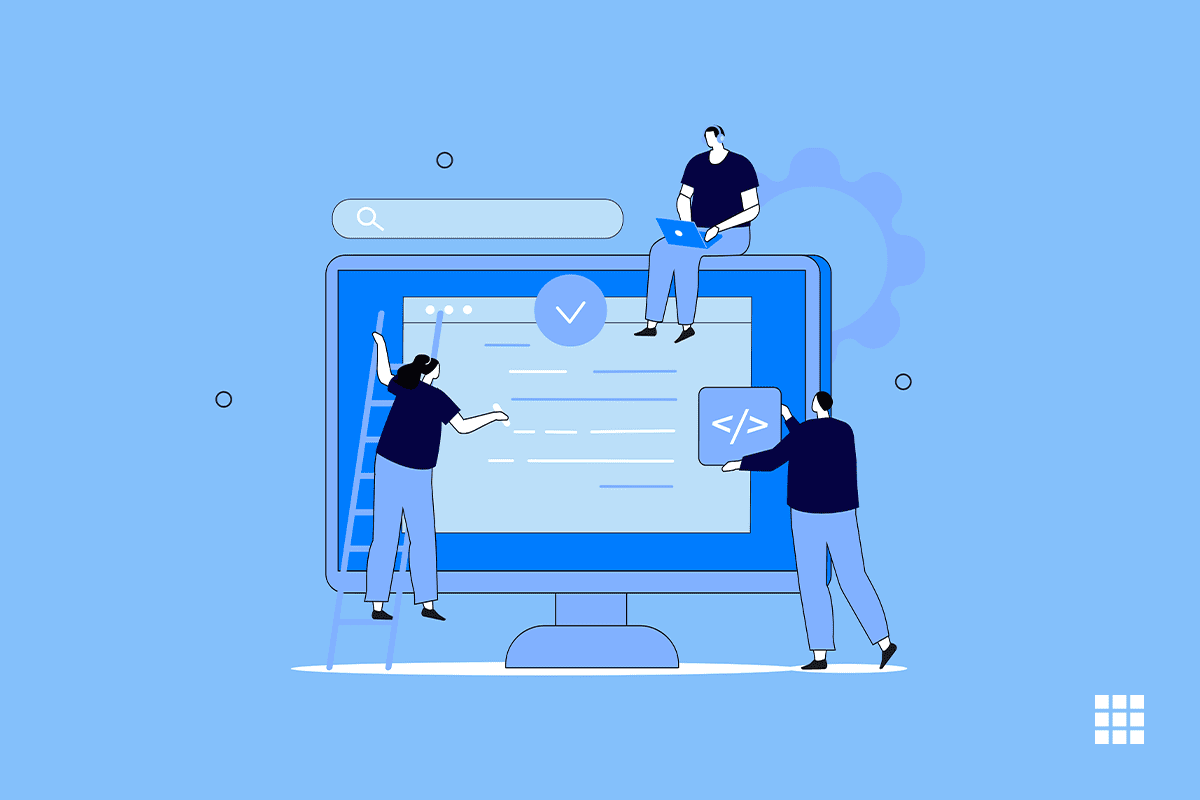
Responsivity
Statista reports 48% of global page views from smartphones and tablets. We found that 93% of consumers left a website because it didn’t look correctly on their device. To provide a fantastic user experience, your site must work on all devices. Techies term this “responsive design”.
A responsive website structure requires investment. A responsive site dynamically resizes and rearranges information to accommodate any device. HTML templates or a mobile site can do this.
Your site’s functionality is more crucial than its appearance across all devices. Your website should work on several browsers and mobile devices. You’ve probably only checked your site in one browser, such Chrome, Safari, Firefox, or another. Open your pages in each browser and check your elements. The presentation should be similar, but you won’t know until you see it.
-
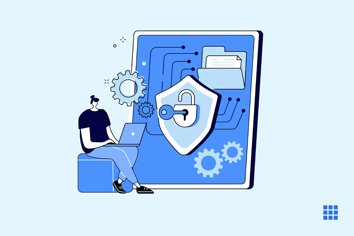
Accessibility
Web accessibility ensures that people with disabilities can utilise websites. Website designers must consider these users when creating UX plans. Accessibility applies to your site’s structure, layout, graphics, and written and visual content, like responsiveness. The Web Accessibility Initiative and World Wide Web Consortium created the Web Content Accessibility Guidelines (WCAG) to make the online accessible to everyone. Websites must generally be:
- Visitors can understand your site.
- Operable: Your website should be versatile.
- All material and notifications are clear.
- Robust: Many assistive technologies, devices, and browsers can use your site.
-
Conventionality
Web design requires balancing originality and functionality. Most of us use the internet well and are acclimated to certain restrictions. These conventions include:
- Placing a page’s main menu on top or left.
- Placing a logo in the upper left or middle of a page.
- Clickable logos that always return visitors to the site.
- Links and buttons change colour when hovered over.
- Adding a shopping cart to a retail website. The icon displays the cart’s contents.
- Ensuring picture sliders feature buttons to manually turn slides.
Another example of design is architecture. Building codes enable safe and comfortable living. Besides legal implications, architects follow these regulations to keep guests safe and pleasant. If the stairs are uneven or you can’t escape in a fire, wait outside.
You need to satisfy users while creating a memorable experience. Your site may upset visitors if you deviate from expectations.
Conclusion
Here is hoping that you have understood the article and that you can use these pointers to better your website. In all goodness, ensuring that your website’s experience keeps getting better is the first step towards wooing your customers. So, if you understand its importance, we suggest you follow the pointers discussed above and succeed with your business online.
With this, we close this article as we feel we have discussed many aspects. In cany case you feel we have missed out on something important, please share it in the comments section below. Till then, keep reading guys!

Write A Comment